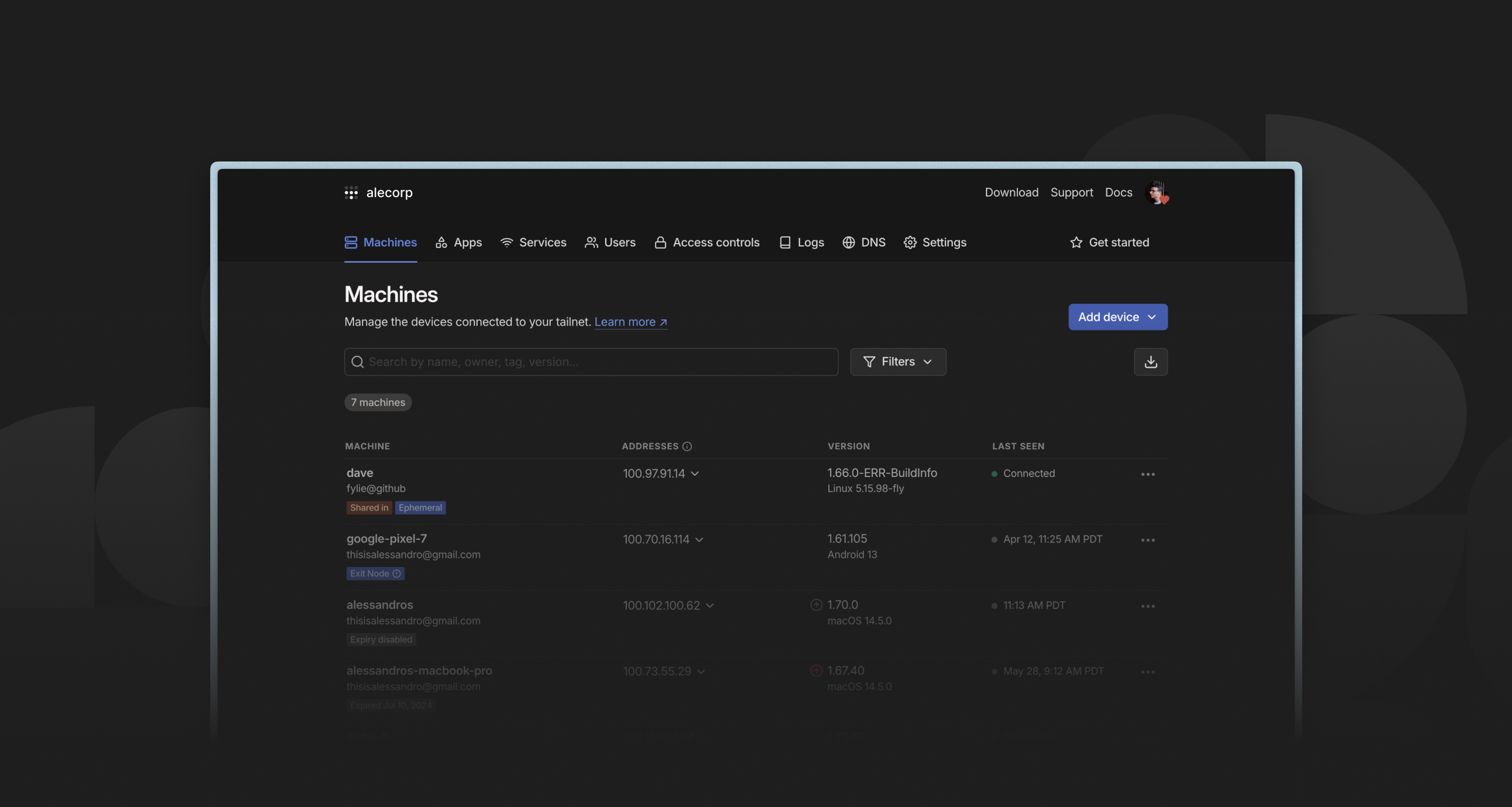
Earlier this summer, after many passionate requests, Tailscale finally joined the dark side. That is to say: we rolled out support for “dark mode” in our admin console. Dark mode users are often enthusiastic and vocal and, feeling the pressure of their expectations, we wanted to make sure we got it right. In this post, we are sharing some of the lessons learned and challenges faced in making our web UIs more vampire-friendly. Working on dark mode for the admin console, turns out, helped us bring some much-needed consistency to our products for the web.
First, though, some background. We did have some earlier experience with dark mode thanks to the iOS, Android, and Apple TV apps. But working on dark mode in the admin console meant integrating it deeper within our design system. After all, the admin console is where all the web components are hosted, and all the design system “logic” is encoded (like color definitions and relationships, typographic rules, usage and accessibility guidelines, etc). For the web, we build in React, using Radix as the base for out-of-the-box accessibility for the more complicated components. All our styling is done through Tailwind, which is great, but is quite opinionated when it comes to dark mode.
Working at the speed of light (mode)
One set of lessons we learned arose out of issues we encountered with our color palette.
Color scales often have a bright, saturated middle, but diverge at the extremes: the lower the brightness, the higher the saturation needs to be, and vice-versa. This helps preserve the character of the colors at darker points in the scale.
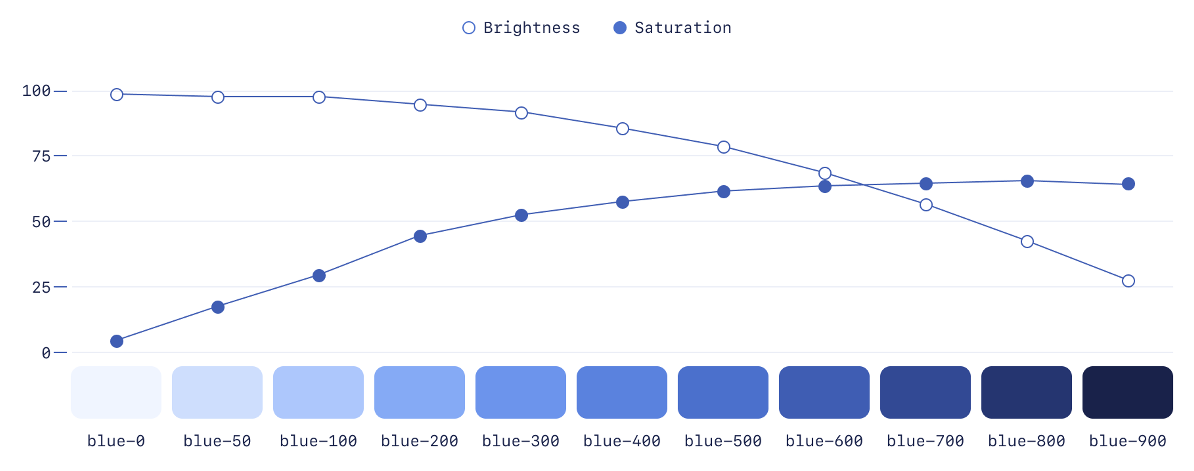
When choosing colors for disabled buttons, you want the colors to feel more muted, to imply the button is “inset” and not clickable. In light mode, choosing colors was easy: lighter shades of our color scale are less saturated, so they already felt more muted than darker ones.
In dark mode, it was less straightforward. We couldn’t keep using lighter shades, since that’d increase contrast with the dark background, and make disabled buttons feel more prominent than enabled ones. We needed to use darker shades, but darker shades increase in saturation, which also makes the buttons feel less disabled.
Faced with this, we had a few options. We could:
- Rework our color palette, lowering the saturation of the darker shades, but still making sure they work as well in dark mode as they do in light mode. This would significantly delay the release since changing colors meant re-checking lots of UI elements across the app
- Add an alternative color palette where colors are slightly tweaked and optimized for dark mode. This also would significantly delay the release.
- Accept that disabled states would be less than ideal. This would allow us to release on time, but would compromise the experience (and likely keep us up at night).
We didn’t like any of these options, so we started exploring alternatives. One idea we had was to use opacity to make disabled elements look inactive, even with the more saturated base colors.
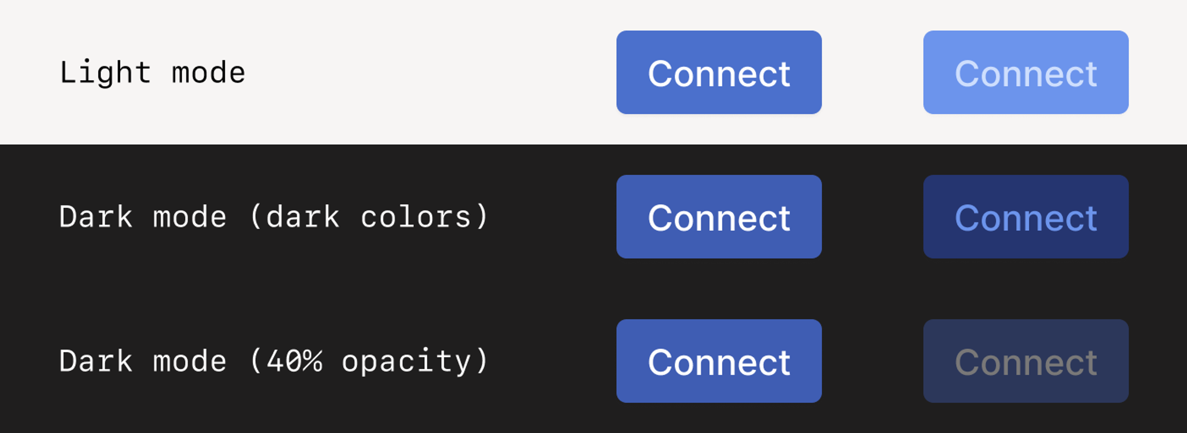
Designers generally avoid this approach because opacity makes working with color more complicated: when using opacity, UI elements change color depending on their background, and when building reusable components, this means you now need to think about foreground, background, and the combination of the two. It means having more unspoken rules that users of the design system need to watch out for.
That said, in our case we only use two background colors. While we don’t love adding more complexity for members of our team, it’s not often people will run into issues with those combinations, and this choice bought us more time to rework our palette.
Another place where our existing color palette didn’t quite do the trick is with layering and shadows.
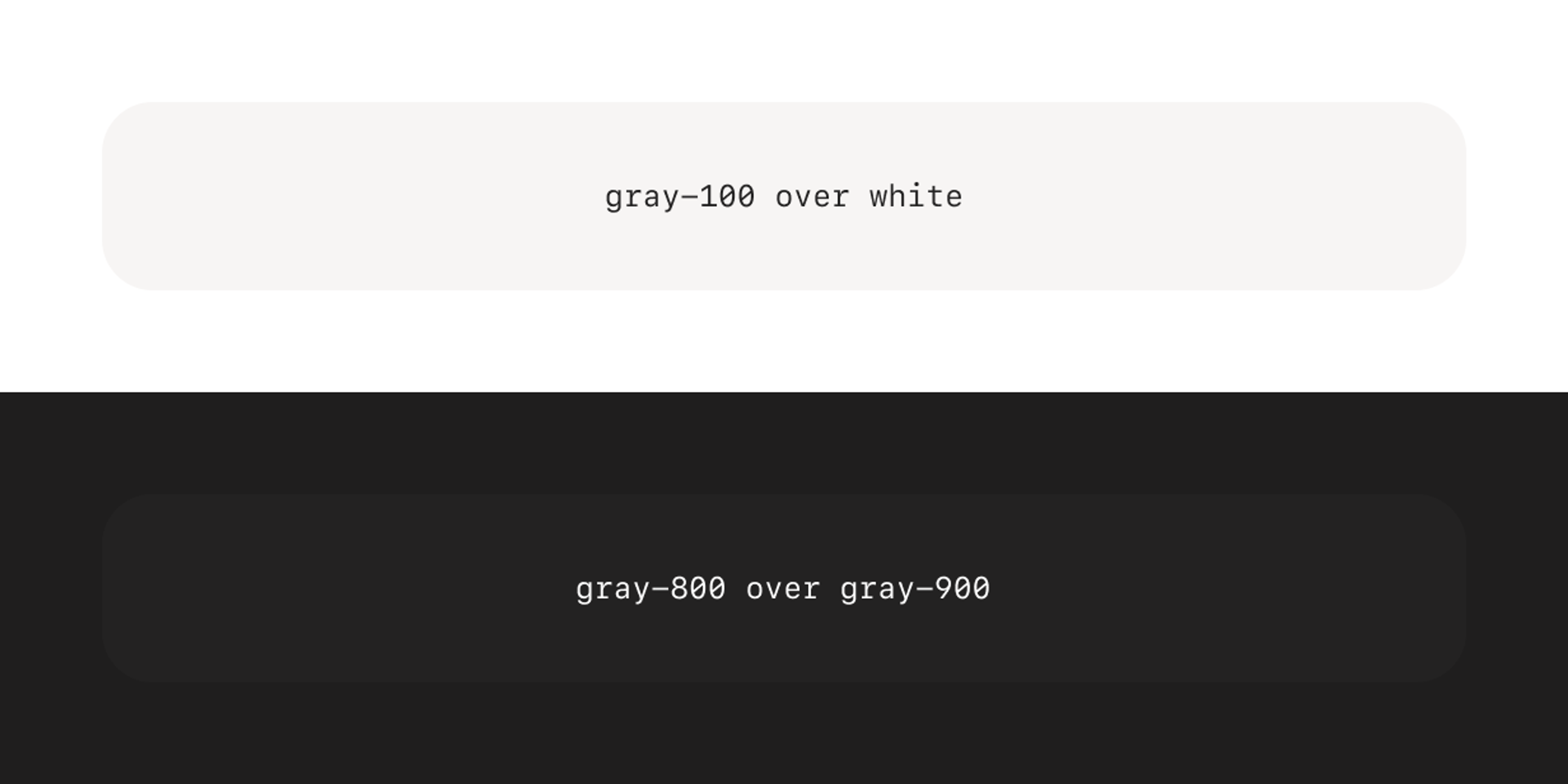
In light mode, small changes in brightness between background and foreground work fine. Too small a change, and the difference may be hard to see on some monitors, but what we have between white and gray-100 has worked well for us over the years. In dark mode, the difference between gray-900 (our darkest gray) and gray-800 (a step lighter) was not enough.
Shadows too are troublesome. A black shadow at 10% opacity easily adds enough depth in light mode, but does nothing to elevate elements over the already dark backgrounds of dark mode. All of this became more apparent the more we layered UI elements, like in dialogs, toasts, and popovers.
We had a few parameters to play with: borders, shadows, and backdrops to name a few. Look around and you’ll find different apps solve this by mixing these parameters in different ways. Some services, like Vercel, make up for the lack of contrast by darkening the backdrop more than usual. Others, like X (formerly known as Twitter), even invert shadows, turning them into a white glow in dark mode.
To address these contrast issues we added a darker gray ( gray-1000 ) to the end of our scale, added a border to most elevated surfaces, and made our shadows more than twice as opaque. Several small tweaks stack together to fix the problem:
Who’s afraid of the dark?
In general, we’ve found that working on dark mode made our design system better because it forced us to face (sometimes scary!) decisions that would have otherwise been delayed and piled up as technical debt.
One example is our Snippet component. It’s used to display a snippet of code or a command line prompt that is copyable with one click. Before the change, it had 3 variants: light, dark, and basic. Revisiting it for dark mode made us realize that the basic variant was a one-off that slipped through the cracks, and we eliminated it. Light and dark were used for stylistic purposes, but the naming didn’t make sense anymore: should the light one turn dark in dark mode? Initially, we thought of renaming them to default and inverted, but we soon realized that the inverted one was also used only once. By removing it and simplifying our usage even further, we now only have a single style that adapts to the theme.
Another example is focus states. While only supporting light mode, we could get away with a mix of default browser styles and custom ones. That’s because the default browser styles work pretty well with most of our UI components, except for a few that we had to correct manually. That was not the case in dark mode, as some browsers don’t have a different style for deep dark mode focus states like they do for scrollbars and autofilled inputs (styles you can enable with the color-scheme CSS property). This pushed us to customize all our focus styles, for light and dark mode alike, which forced us to confront some choices we had been postponing, like being consistent in our usage of ring and outline Tailwind classes (we chose outline, as it’s a little more accessible) and gave us an excuse to go back and improve focus styles for most of our components.
Perhaps the best example of how dark mode pushed us to better our design system is how it has forced us to expand our set of semantic classes. While we mostly stick to using Tailwind’s utility classes, we supplement them with a range of semantic class modifiers like -text-base , -text-muted and -text-disabled that help us enforce our design system guidelines (in this case, those are the only text colors we use, as we tested their contrast ratios against our most common backgrounds). This way, instead of having to recall a specific shade of gray for muted text in light mode (text-gray-500) and its dark counterpart (dark:text-gray-400), you can just use text-text-muted . Not only is this more memorable, but it’s a single class that makes sure the right shade is used no matter the theme. Here’s how it works behind the scenes:
main.css
===
@tailwind base;
@tailwind components;
@tailwind utilities;

@layer base {
  :root {
    --color-text-muted: rgb(var(--color-gray-500) / 1);
    --color-outline-focus: rgb(var(--color-blue-100) / 1);
    --shadow-lg: 0 10px 15px -3px rgb(0 0 0 / 0.1), 0 4px 6px -4px rgb(0 0 0 / 0.1);
  }
  :root.dark {
    --color-text-muted: rgb(var(--color-gray-400) / 1);
    --color-outline-focus: rgb(var(--color-blue-700) / 1);
    --shadow-lg: 0 10px 15px -3px rgb(0 0 0 / 0.3), 0 4px 6px -4px rgb(0 0 0 / 0.3);
  }
}
tailwind.config.js
===
module.exports = {
  boxShadow: {
      […]
      lg: "var(--shadow-lg)",
      […]
  },
  extend: {
      colors: {
        ...styles.colors,
        "text-muted": "var(--color-text-muted)",
        "outline-focus": "var(--color-outline-focus)"
        }
    }
}
While going through the codebase, making sure every color definition had its dark: counterpart, it became easier for our sanity to define more and more of these semantic classes, like -border-base, -border-focus, -border-focus-danger, and so on. Going through this exercise also allowed us to improve older UIs that were coded before the introduction of these semantic classes and update them.
Spotlight on the little details
Beyond all the color and design system decisions, there were also several details in the implementation we used that make switching and using themes a nicer experience:
- When toggling the theme, we forcibly disable CSS transitions to prevent elements from slowly fading between light and dark colors. This helps the transition between themes feel snappy.
- We use the
<meta name=”color-scheme” />property to signal to the browser that the page supports a dark theme. This sets better defaults for scrollbars and autofill colors, but it also tells the browser to show a light or dark placeholder while the page loads, preventing a flash of white for folks with slower connections. Using themetatag helps this take effect sooner, compared with the equivalent CSS property, which requires the CSS to load first. - And we embed an inline
<script>to the document<head>which reads the user’s theme preference right away. This means users using Tailscale’s light mode on a dark mode OS don’t have to wait for our javascript bundle to download and parse before having their theme preferences respected — it feels instant.
What, still here? Hand it over. That thing, your dark mode
We have learned a lot from getting the admin console dark mode shipped, but we can’t rest yet. We were able to pay down some technical debt, and in the process we discovered some new areas to work on. Most of this work is still in progress:
- Our non-admin console web pages (login, authorize a new device, etc) still need dark mode support. While our experience so far will help, there are some implementation steps we have to make sure we get right before we can tackle this.
- Our color palette still needs improvement. Opacity hacks and one-off extensions only go so far, and may complicate future design projects if we don’t take the effort to fix them soon.
- There’s still a long tail of tiny custom styles (e.g. a few custom focus and hover states) that need to be ironed out and adapted for dark mode.
- Our semantic variables aren’t as comprehensive as we’d like.
- There are slight inconsistencies between our usage of dark mode colors in the admin console and the mobile clients.
But of course, a design system is never “done” — it’s constantly in evolution, and dark mode is no exception. Setting all that aside, we come to our final lesson: it’s always a good thing to ship, and ship we did. We have a workable dark mode that our users love, and a more robust design system as a result.
 Alessandro Mingione
 Ross Zurowski


